Divi 3.0 Review
do you believe in magic?
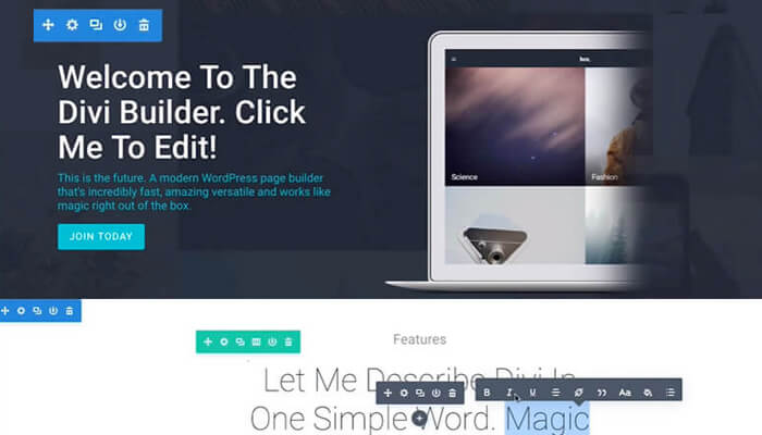
When it comes to WooCommerce, Divi is our go to Theme. Divi 3.0 introduces a whole new “visual builder” (also referred to as a “front-end editor”) that has been rebuilt from the ground up using React, a modern JavaScript library for user interfaces. The new builder allows users to edit their WordPress pages on the front-end of their website using simple and beautiful visual controls. When you activate the builder, you see your page exactly as it would appear on the front-end of your website.
However, with the builder active, the page becomes editable using Divi’s wide array of content elements and design settings. You can easily click into a paragraph and automatically start typing, highlight text to adjust its font, size and style, or open up settings to change an element’s content, appearance and positioning. Changes such as resizing, deleting, or duplicating elements are made easy. Because you are able to manipulate everything in a natural and intuitive way, the page becomes alive and every element feels tangible. Changes in design or content appear as they are being made. With the new visual builder not relying on traditional loading, there is a need for page refreshes, or Ajax loading bars during a majority of the builder experience. This is the future of WYSIWYG.

Add New Content From Divi’s 40+ Modules
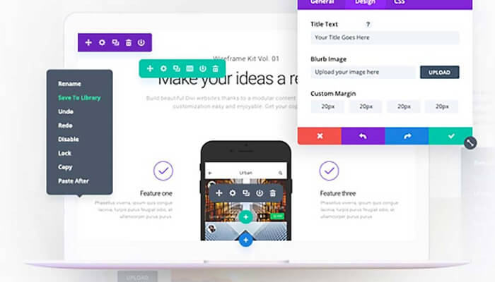
Adding new content in Divi 3.0 is simple. Simply Hover over the location (area) you wish to add content to and click the + button. You are then presented with a list of Divi’s 40+ content modules which can be used to build just about any kind of website. There is no need to drag and drop content from a central dock because Divi’s content tooltip is always there when you need it.
Easily Customize Everything
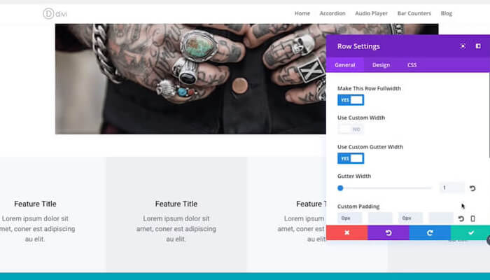
The beauty of Divi 3.0 becomes apparent when you begin to adjust your content’s design. Everything can be customized, and you can see those changes appear in real time:
- Choose from dozens of custom fonts.
- Adjust text color, size, line height and letter spacing.
- Add custom padding and margins.
- Change column structures and row heights.
- Add background colors and images.
- Enable parallax backgrounds and video backgrounds.
- Drag, drop, copy and paste content elements.
- Apply different design settings for each responsive breakpoint.
- Drag to adjust row heights and widths.
- Enjoy A Beautiful Inline Editing Experience
When the new visual builder is active, all text on the page become editable. Eliminating the need to open up an element’s settings and adjust the text content. Simply click into a paragraph and begin typing to add text. Highlighting text opens up the option to adjust font, size, style and spacing. Divi 3.0 created an inline editor UI that is super smooth and wonderful to use. If you have previously been frustrated by the overloaded (congested) TinyMCE interface, you are going to be satisfied using Divi 3.0.

Experience Unbelievable Speed
Divi 3.0’s visual builder is possibly the fastest online website building experience you will ever use. There is a small amount of page refreshes or Ajax loading bars. In fact, there is no traditional loading of any kind during most of the building process. This is due to how JavaScript powers the builder and that the building experience occurs entirely in your browser. So, Instead of relying on communication between your browser and your server for changes to occur, the Divi 3.0 only waits for the time it takes the application to compute each change. When used with a decent (adequate) computer and a modern browser, you will experience instant updates as you are adding and adjusting your content. Server load, server speed and Internet speed are no longer a big factor.

The “Invisible” & Customizable Builder Interface
The new visual builder was nick named the “Invisible Interface”, referencing one of their core design philosophies, which is that “good design often goes unnoticed.” The ideal UI is one that doesn’t get in the way of your process, and one that knows the results you are aiming for and gives you solutions on obtaining them. This is what makes an interface truly “intuitive.” Divi 3.0 doesn’t bombard you with unnecessary grids, lines and buttons. There are no floating headers or sidebars to steal away your screen real estate or overlays to obscure your vision. When you first load the builder, you might not even be aware it’s there, it’s not until you begin to delve deeper into the page with your mouse that the controls become apparent.
Divi 3.0’s visual builder is the first WordPress page builder to offer a customizable interface. This means that you aren’t pigeonholed into certain UI conventions when it comes to how the builder’s controls are displayed. You can choose to either have these settings appear in a modal popup or you can snap that popup to the side of the page and enter “sidebar” mode. You have the option to adjust the size and position of the popup and sidebar so that you free to optimize your space based on the size of your screen or the content on your page.
